Bloom Mobile App —
UX strategy and UI design
Project background —
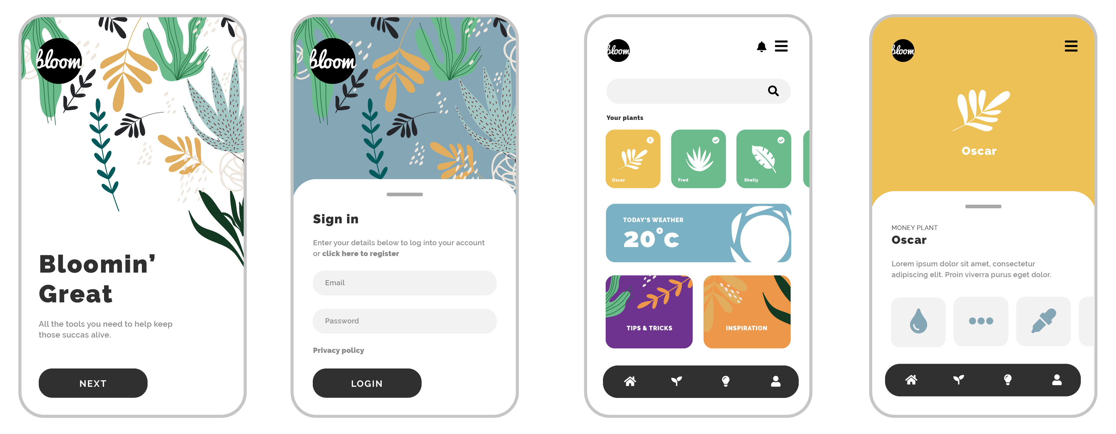
A fun, user-friendly app to help with the age-old challenge of keeping those house plants going strong. The app is centred around making the art of botany accessible to all. Offering a personalised guide and making the information easy to digest and understand for even the most lethal plant owners.
Scoping and planning —
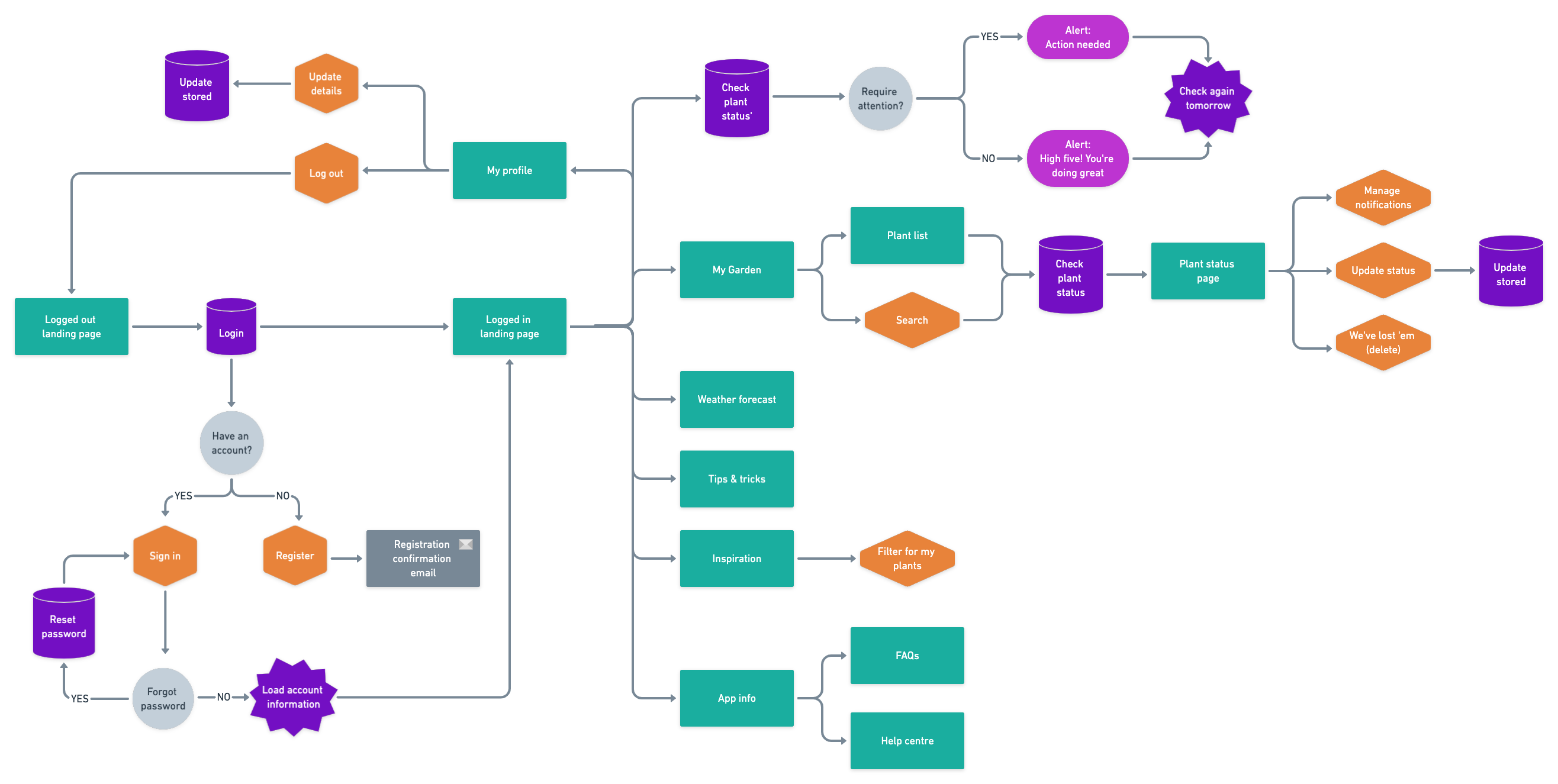
The user flow for the app is focused on personalising the experience as much as possible, and using gamification to make the app fun to use. The app not only allows the user to track the health of their plants, but also allows them to assign names to further personalise their profile. As well as the information specific to their own plants, there is also generic information, tips and information available.
Design —
The design utilises vibrant colours and iconography to create the most user friendly interface possible. A selection of the colours in the palette have been assigned to differentiate the health status of the plants, whereas others have been allocated to define the content type. This use of the palette helps to increase familiarity with the experience making it easy to use from the first visit, while retaining the vibrancy of the overall brand identity. Considerations have also been make for accessibility, ensuring the font sizes meet the WCAG standards and also including text labels alongside the iconography for best practice.