UX Lead
Product Manager
Full lifecycle
User Research, User Flows, System Flows, Wireframing, Prototyping, Interaction Design, Information Architecture, UX Writing, UAT management & User Testing, Project/Product Management
01. The challenge
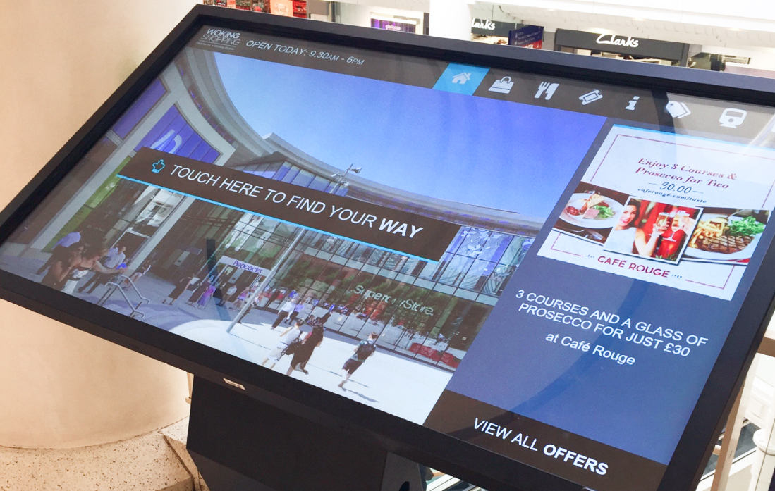
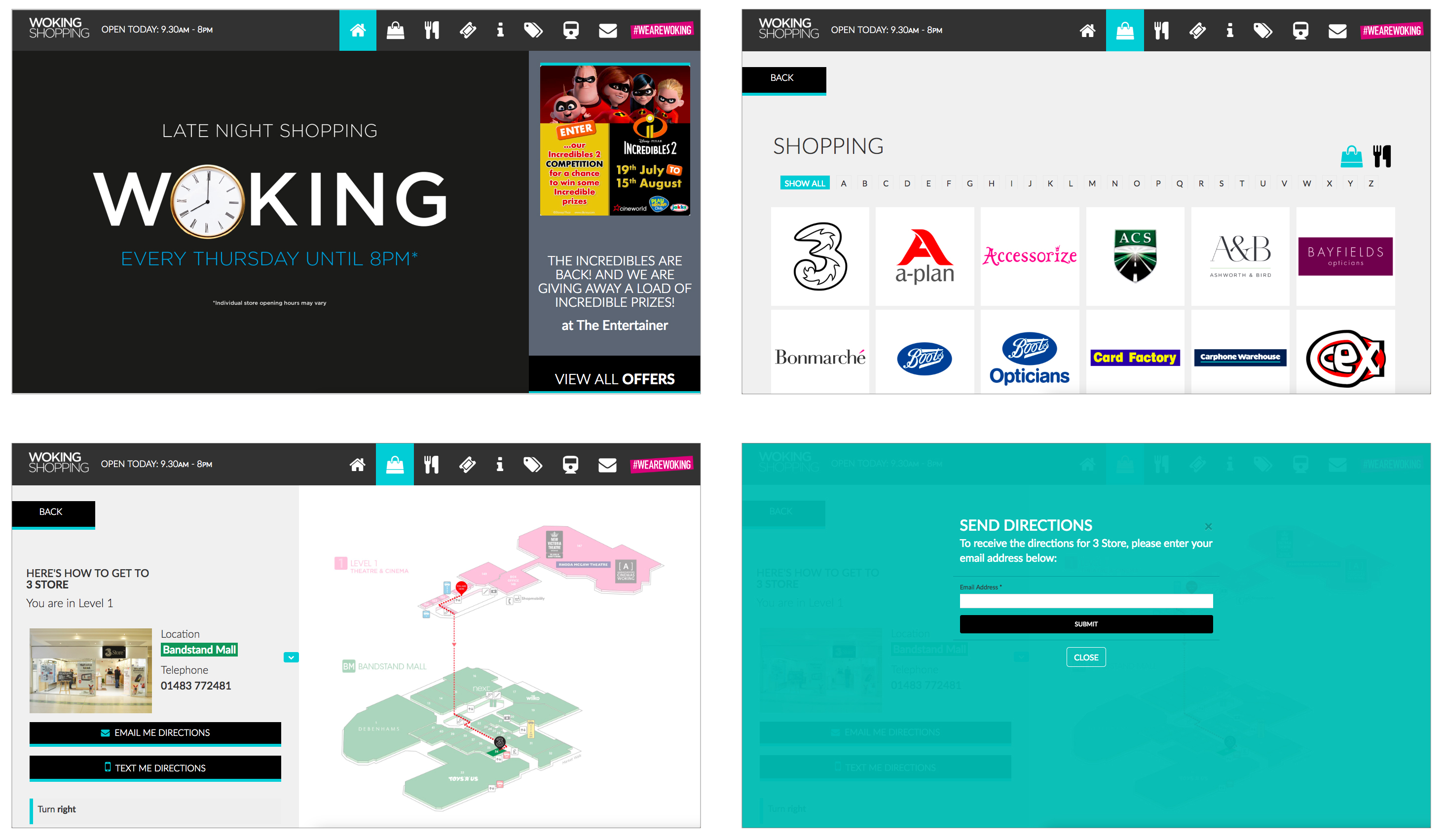
Having impressed with the website redesign and rebuild, we were asked to create a solution for in-centre touch screens.
The screens were to work as an information point for visitors as well as a wayfinding tool to direct visitors to locations within the centre.
02. Research & Discovery
Scoping & Planning
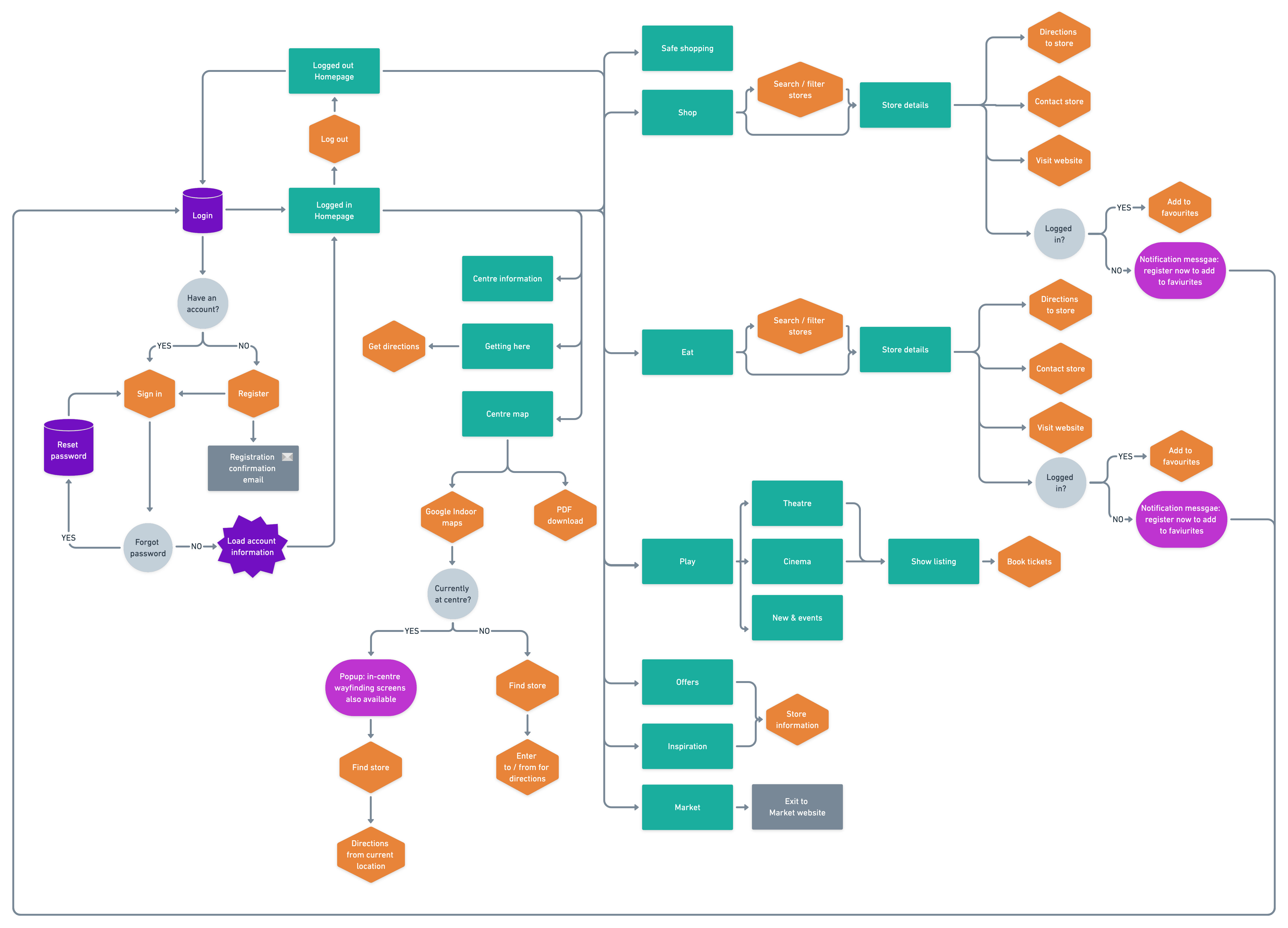
The client had identified the screens that were going to be installed, and I was tasked with the scoping, build, installation of the system and ongoing maintenance. As project lead and programmer, I approached this by firstly assessing the best solution that could utilise the information already present on the website and present this in the most appropriate format for the touch screens. This would mean that the ongoing maintenance would be relatively simple for the team to manage as it would be managed within a setup that they were already familiar with.
While scoping the project we were informed that the number of screens had increased from 3 screens to 7 screens. Although this obviously had a significant impact on the project plan and deliverables, we were still able to launch all 7 screens within just a few weeks of the initial deadline date.
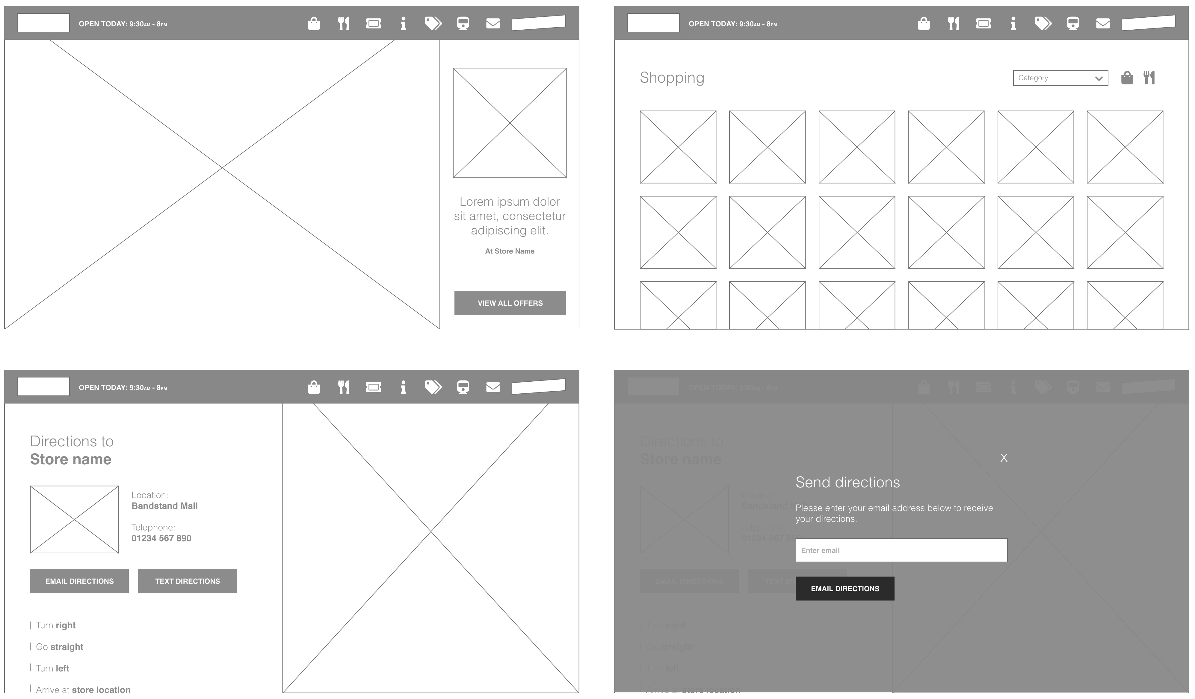
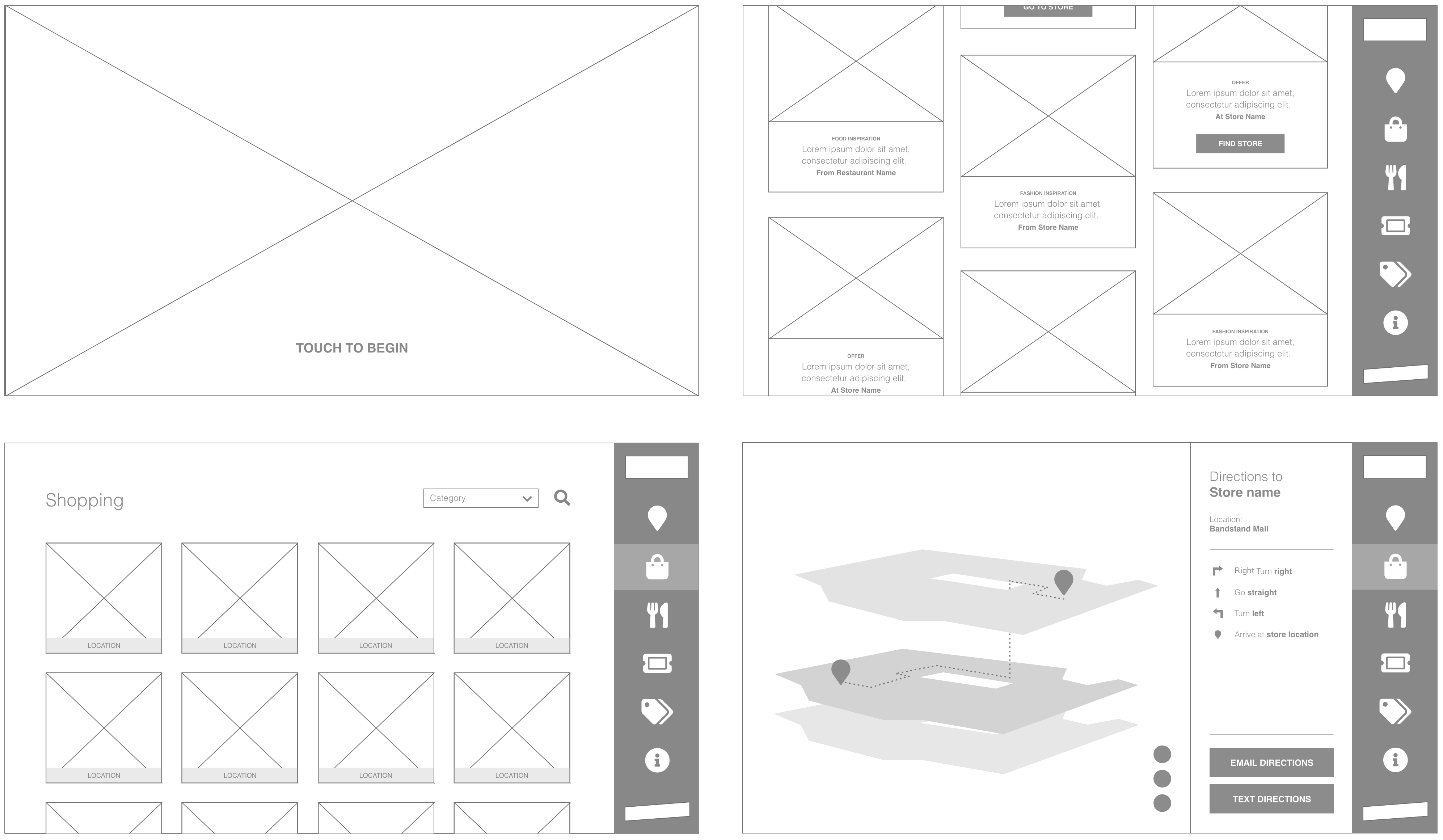
03. The Solution
Design
The design was crafted to create an immersive experience that felt more like an app and was tailored to the touch screen usage. The CTAs and buttons were designed to be bold and clear for the best usability, while still reflecting the style of the main website and also adhering to the design system and brand guidelines.
Build
After outlining the system setup and mapping out a simplified user journey compared to the existing site, I proceeded to restructure the website code to incorporate touch screen pages. By integrating the system into the existing website, it leveraged the established framework, which minimised the need for additional resources and reduced the overall impact on the site’s size.
Testing & Launch
As well as the usual internal and client testing, the snag tests for this project also involved testing the installation of the system onto the screens within the centre. Although we were able to access the site remotely, much of the testing required site visits in order to complete thorough user testing and also to confirm if any issues identified were with the site or the touch screen system. This meant that a strong collaborative approach with the screen management agency was extremely important in order to ensure that any issues were resolved as quickly and efficiently as possible and also to ensure that the client received accurate and joined up status updates.
Analyse & Iterate
Once the initial system was set up the ongoing maintenance was very smooth. The team members were trained on the system and updates were able to be completed across all screens within hours of the clients request.