UX Designer
Product Designer
Full lifecycle
User Research, User Flows, System Flows, Wireframing, Prototyping, Interaction Design, Information Architecture, UX Writing, UAT management & User Testing, Project/Product Management
01. The challenge
Udozi allows shoppers to locate products in-stock at stores nearby. The brief was to design an engaging look and feel for the app, alongside considered functionality to craft an intuitive user experience.
Udozi is dedicated to supporting and enhancing the traditional method of shopping, while developing innovative ways to drive footfall to physical stores. By leveraging existing and emerging technologies, the app aims to create an experience that combines convenience and delight for users.
In order to achieve this, both the back-end functionality and user-facing experience had to be seamless, focusing on key objectives and features of the product: to provide an outstanding search experience, scannable content layouts and an intuitive navigation experience.

02. Research & Discovery
Scoping & Planning
Understanding how the concept for the product was conceived was essential in order to accurately capture the intention and vision. This understanding illuminated how the product addresses a specific need, guiding its positioning, shaping user expectations, and defining the tool’s intended functionality.
User Research & Competitor Analysis
Building on this foundational understanding of users, I conducted a competitive analysis of both commerce apps and successful applications from other sectors. Coupled with discussions with prospective users and feedback from retailers, this approach enabled me to accurately define the product scope, ensuring an optimal user-centric experience while meeting business objectives.
03. The Solution
System Structure & Functionality
I collaborated closely with the implementation team from the project's outset to understand system capabilities, limitations, and optimal solutions for surfacing the data intuitively to users.
Consideration was also given to added value features that, while not intended for the Day 1 release, would inform decisions regarding the system's structural setup. This foresight planning helped prevent potential overhauls in the future and ensured all members of the team were aligned with the product's vision.
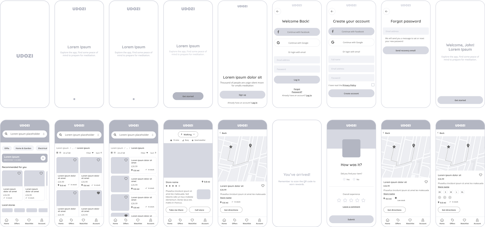
Information Architecture & User Flows
The next stage was to outline the information architecture and user flow. This not only ensured all touch points were covered while identifying opportunities for further engagement, but also allowed consideration for a seamless transition between the digital and real-world experiences.
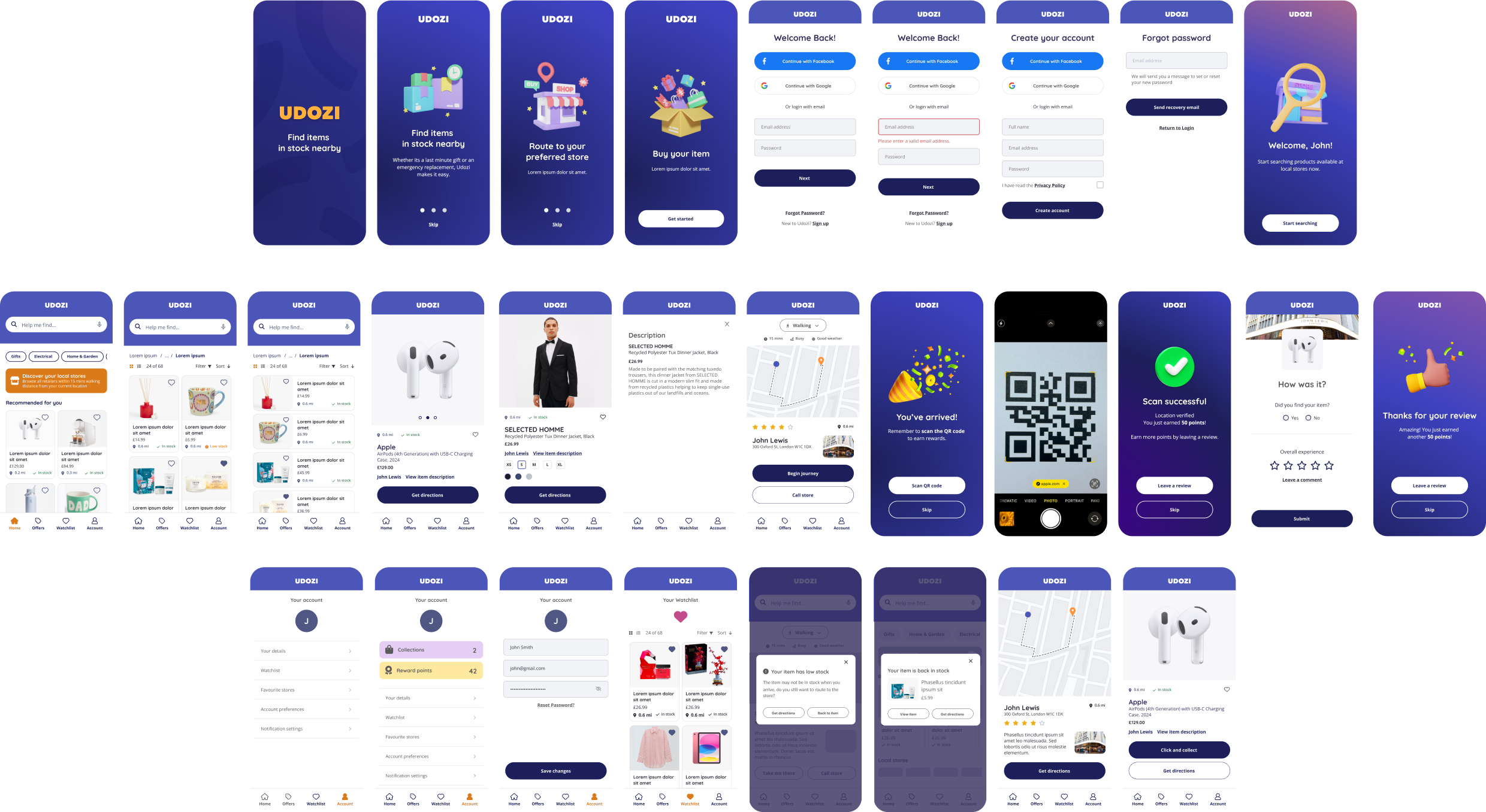
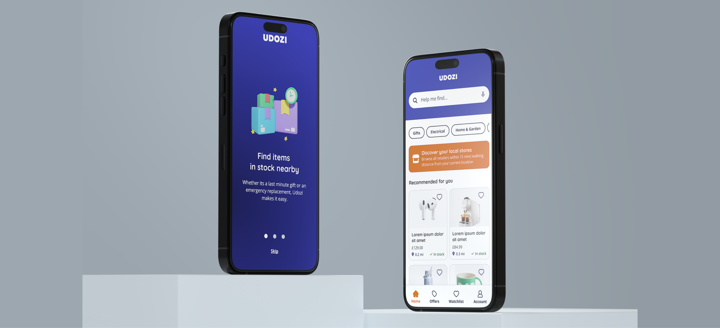
Design
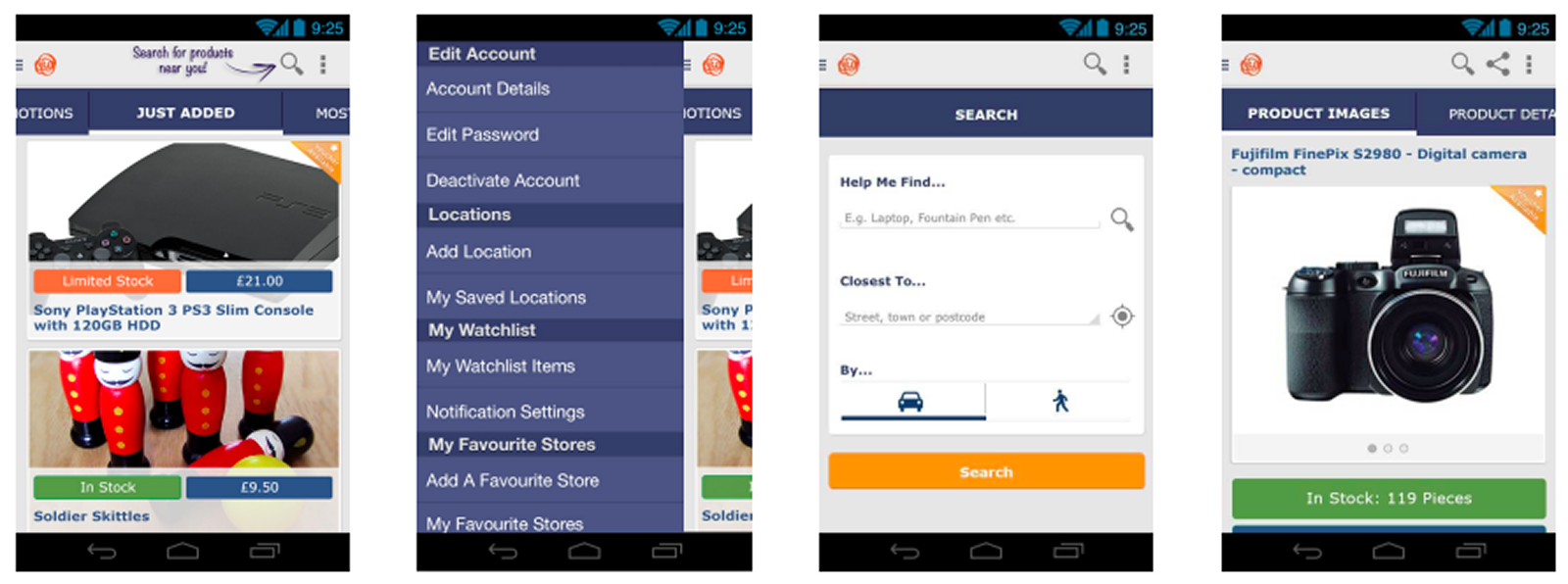
The initial design was created in 2013 and used the brand palette and guidelines in place at the time. The objective when creating the design was not only to bring the app to life, but also to use best practice and user familiarity to inform the layouts, positioning and overall look and feel.
A modular component approach was also used to ensure a robust design system, to ensure consistency and to allow for new pages and updates to be rolled out efficiently and effectively.
Ensuring Brand Harmony
In addition to the layout and overarching look and feel considerations, there was also the need to consider the onboarded retailer brands and assets in order to maintain the standard and quality of the Udozi interface. It was imperative that guidelines and guardrails were supplied to retailers in order to ensure consistency across the experience.
04. The Result
The MVP was tested internally, by prospective users and was also used in demonstrations to retailers. Since the initial launch, I have rescoped the design and crafted a Day 2 look and feel to modernise the app, elevate the user flow and accessibility, and also to conceptualise the integration of the added value features, such as the gamification.
The updated interface aims to refine the brand’s styling and colour palette while adhering to the latest accessibility standards and fostering a more guided narrative throughout the user experience. The new design also incorporates a conversational interaction approach, enabling users to leave reviews and feedback for retailers and the overall experience. This feature enhances user sentiment and provides valuable data to retailers and stakeholders, which can inform future iterations of the app.